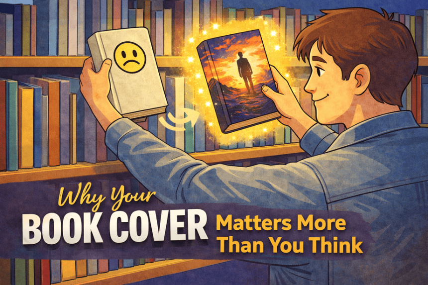

Why Your Book Cover Matters More Than You Think
I love a good fantasy, especially one with a strong romantic thread or a full blown romantasy. On paper, Quicksilver by Callie Hart should have been an instant “add to cart” for me. The premise is exactly my thing. But for the longest time, I did not even pick it up to read the back, because the original cover made it look like a generic drugstore paperback you would grab in CVS and forget in a hotel room. It had that slightly dated, homemade Photoshop feel; nothing about it said “dangerous Fae, enemies to lovers, sharp banter, emotional damage.”
What makes Quicksilver such a fascinating case is what happened next. The book took off anyway. BookTok, reader reviews, and pure word of mouth dragged it into the spotlight despite its packaging, not because of it. As it went viral, people did not just rave about the story; they talked about the cover. There was a whole mini saga online of readers saying, “This book is incredible, but the cover does it dirty,” joking that it looked like a random mass market romance from a bargain bin and begging for a redesign. Even though Callie Hart was already a successful author, you could see how heavily the cover was criticized in comments, TikToks, and threads. The success and the criticism ran side by side: “five stars, life-ruining book” alongside “please, someone give this the cover it deserves.” Eventually, new editions with sprayed edges and upgraded art appeared, which felt like the visuals were finally catching up to the reputation.
Most of us are not going to get that kind of miracle. For a new or mid-list author, your cover is not decoration; it is a tool. It buys you a second of attention, or it quietly kills your shot.
Why your cover is part of your story
As writers, we like to think the words are what matter. But readers meet the cover first. Before they know your characters or your prose, they are asking, often subconsciously:
- Does this look like my kind of book?
- Does it feel professional and intentional?
- Do I trust this enough to give it a few minutes of my life
A strong cover:
- Signals the right genre and subgenre at a glance.
- Sets an emotional expectation: cozy, dark, swoony, eerie.
- Looks polished enough that a stranger feels safe taking a chance.
If your name is already big in your niche, you get a little wiggle room. Fans will click because you wrote it. But if you are newer, or your audience is still growing, the cover is doing the introduction on your behalf. You want it saying “this is for you,” not “keep walking.”
Great books whose covers do them no favors
Here are some great books whose covers do them absolutely no favors.
Quicksilver by Callie Hart (fantasy romance, romantasy)
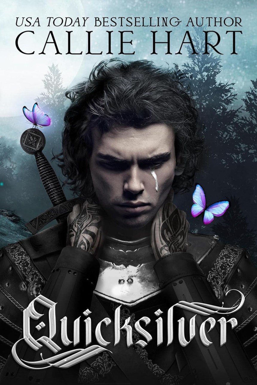
Quicksilver is exactly the kind of book I devour: dark Fae, enemies-to-lovers tension, sharp banter, real stakes. But the original cover looks like a random drugstore paperback, not a high heat romantasy. Soft photo, bland fonts, nothing that whispers “magic” or “danger.” Fantasy romance readers talk openly about skipping it for ages because nothing about the art said, “this is that book.” At the same time, there was a whole wave of online criticism aimed specifically at the cover. Readers praised the story and dragged the design in the same breath, calling it outdated, off-brand for the genre, and begging for a relaunch. When it finally exploded, it was because BookTok champions and gushing reviews pushed people past the cover and into the pages. New special editions with sprayed edges and upgraded art arrived later, design catching up to the reputation and answering that chorus of “this deserves better.”
Lord Valentine’s Castle by Robert Silverberg (classic fantasy)
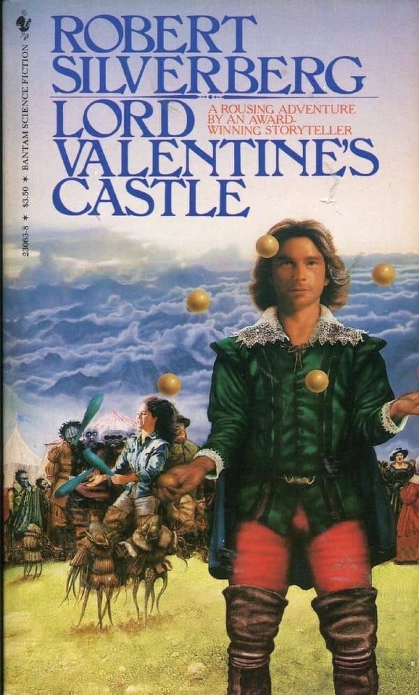
This is a respected, imaginative science fantasy novel, but the older cover art often gets dragged in “worst fantasy cover” roundups. The composition is busy, the proportions are off, and the overall effect feels more like a caricature of 80s fantasy than an invitation into a rich, layered world. If you already know Silverberg’s name, you will push past it. If you do not, the cover can make the book look cheap and dated instead of timeless.
The original Black Company trilogy by Glen Cook (grim, character driven fantasy)
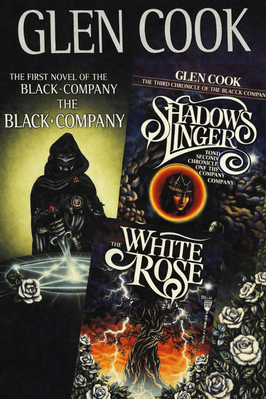
Inside, these books are gritty, smart, and hugely influential. Outside, the first run covers are… a lot. One blogger who loves the series says all three are so bad they had to treat them as a set: book one has a leather-clad, Darth Vader-ish figure stabbing a pentagram; book two floats a woman’s face in a random window in the sky; book three is dominated by a giant tree shooting lightning. Each image technically relates to the story, but together they read more campy and confusing than compelling, and they do nothing to communicate how grounded and voice-driven the books really are.
Kate Daniels series by Ilona Andrews (urban fantasy)
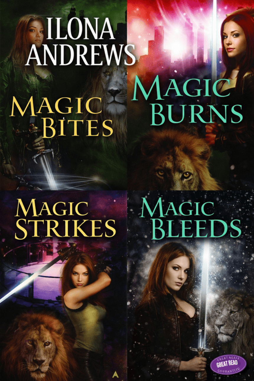
Readers in fantasy romance spaces routinely call out the early Kate Daniels covers as “great books, terrible covers.” The art leans hard into dated urban fantasy clichés: awkward model poses, odd lighting, and typography that looks like an old TV movie poster. The series itself is whip smart, emotionally satisfying, and a favorite comfort reread for many people, but lots of them say they only tried it because a friend insisted, not because the cover sold them.
The Many Great romance with “please don’t judge me” covers
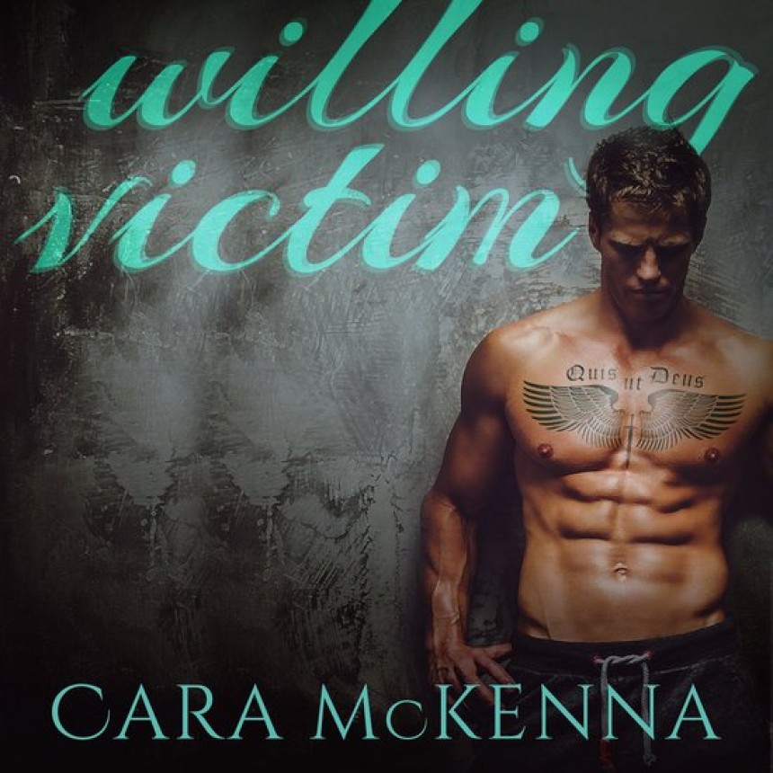
If you have ever seen threads titled “great books with terrible covers,” you know the type. Cara McKenna’s work, for example, gets praised as emotionally complex and nuanced, yet readers complain that covers like After Hours look like generic six-pack porn, completely missing the tone and depth of the story. On the surface, the art says “mindless, disposable smut”; on the page, you get careful character work and grounded emotion. That mismatch keeps a lot of ideal readers from ever clicking “look inside.”
The thread through all of these is simple: the cover and the story are telling different stories.
What a good cover should actually do
When you are planning your own cover, think of it as a tool, not a trophy. It does not have to be the most original thing in the world; it has to be the right thing.
Aim for three core jobs:
- Match your market on purpose: Study the top books in your subgenre. What patterns do you see in font, color, illustration versus photo, and common symbols? You want your cover to sit comfortably beside those, so the reader’s brain files you under “this kind of book” instantly.
- Make one clear emotional promise: Is your book sharp and dangerous, soft and cozy, swoony and lush, eerie and unsettling? Your art, color, and typography should all be voting for the same feeling. Mixed signals confuse people, and confused people do not click.
- Work at full size and thumbnail :Most people will first see your book as a tiny image on a phone. If the title vanishes at small size or the art turns into a blur, they scroll right on past. If it reads clean and compelling as a thumbnail, it will look even better on a shelf.
Getting a strong cover on a real life budget
You probably cannot hire the most famous illustrator in your category, and that is okay. You do not need “fancy.” You need clear, on genre, and professional.
Here is how to get there without selling a kidney.
Do your visual homework
You probably cannot hire the most famous illustrator in your category, and that is okay. You do not need “fancy.” You need clear, on genre, and professional.
Here is how to get there without selling a kidney.
Do your visual homework
Before you talk to anyone:
- Save 20 to 30 covers in your exact niche that you love.
- Note what they have in common: serif versus sans serif, dark versus pastel, illustrated versus photoreal, what is in the center of the image.
- Be honest about where your book actually fits: spicy romantasy, cozy fantasy, dark literary, etc.
This becomes your brief. It helps you communicate with a designer and keeps you from drifting off market.
Find designers in the right places
You do not have to guess:
- Browse portfolios on places like Behance, Dribbble, or ArtStation and search “book cover.”
- Look at designers other indie authors recommend.
- Check BookTok and Bookstagram, lots of cover artists share their work and have links to pricing and premades.
Look for someone who already understands your genre. A designer who nails thriller covers might not be the best fit for romantasy, and that is fine.
Use premades strategically
Premade covers are finished designs where the artist will swap in your title and name. They are usually much cheaper than a full custom job.
They are great when:
- The art is clearly in your genre.
- The mood fits your story.
- You are on a tighter budget but still want something polished.
You are trading custom details for affordability, but if you pick well, readers will never know or care it was premade.
When illustration is not an option, go clean and minimal
If hiring an illustrator is completely out of reach, resist the urge to DIY a complex photomontage. Simple and intentional beats complicated and amateur every time.
For a minimalist, text-based cover:
- Choose a bold, on genre color scheme.
- Use one or two good fonts and make sure your title is big and legible.
- Add a small, strong motif, a blade, a moon, a sigil, a flower, rather than a full scene.
Minimal covers can look very “trad” and stylish, especially in digital storefronts.
Test with real eyes
Do not design in a vacuum. Show two or three options to:
- Critique partners
- Beta readers
- Your newsletter or social followers, if you have them
Ask simple questions:
- “What genre does this look like?”
- “Would you click this?”
If the answers do not match what you are aiming for, that is not a failure. It is free market research before you launch.
You do not need a perfect cover, but you do need an honest one, something that tells the right reader “hey, this is your jam” in the split second before they decide to scroll past or pull it off the shelf. Quicksilver is a great reminder that an amazing story can sometimes overcome a mismatched cover and even spark a whole conversation about what the book deserves visually. Your job is to give your book a better starting position than that.
Cited Sources
Quicksilver by Callie Hart: book page and description (shows original/updated editions)
Reddit r/fantasyromance : discussion of new Quicksilver cover art
TikTok: Callie Hart / Quicksilver cover discussion (BookTok context)
Instagram: new editions of Quicksilver with updated cover and sprayed edges
Reddit r/RomanceBooks: “Great books with terrible covers” (e.g., Cara McKenna titles)
About the Author
Nikki Lopez is a seasoned professional with over a decade of experience in the startup world, specializing in leveraging creative content and community building to empower content creators. Known for a strategic approach and a deep understanding of audience needs, Nikki has a proven track record of leading the development of engaging content strategies and guiding the growth of thriving communities. Her leadership focuses on fostering meaningful interactions and impactful journeys for both creators and their audiences.