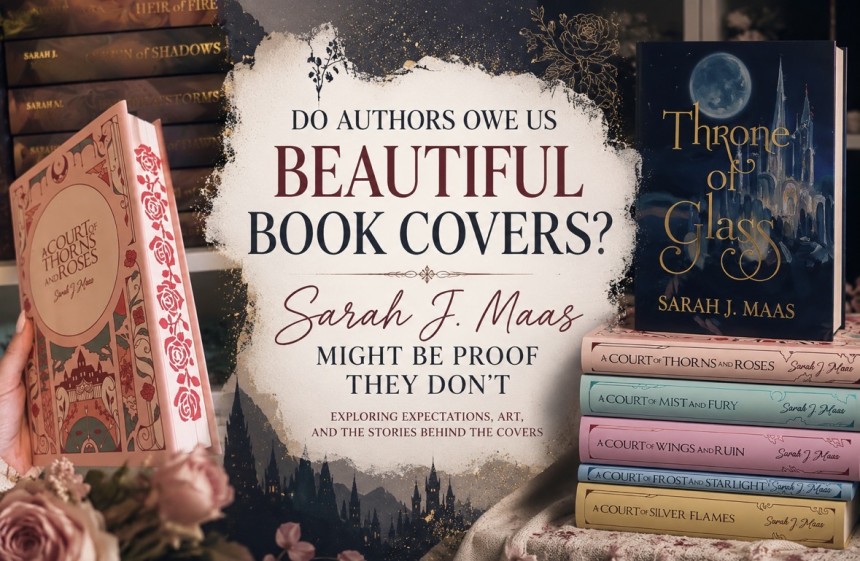

Do Authors Owe Us Beautiful Book Covers? Sarah J. Maas Might Be Proof They Don’t
I don’t like Sarah J. Maas’s new book covers.
There. I said it.
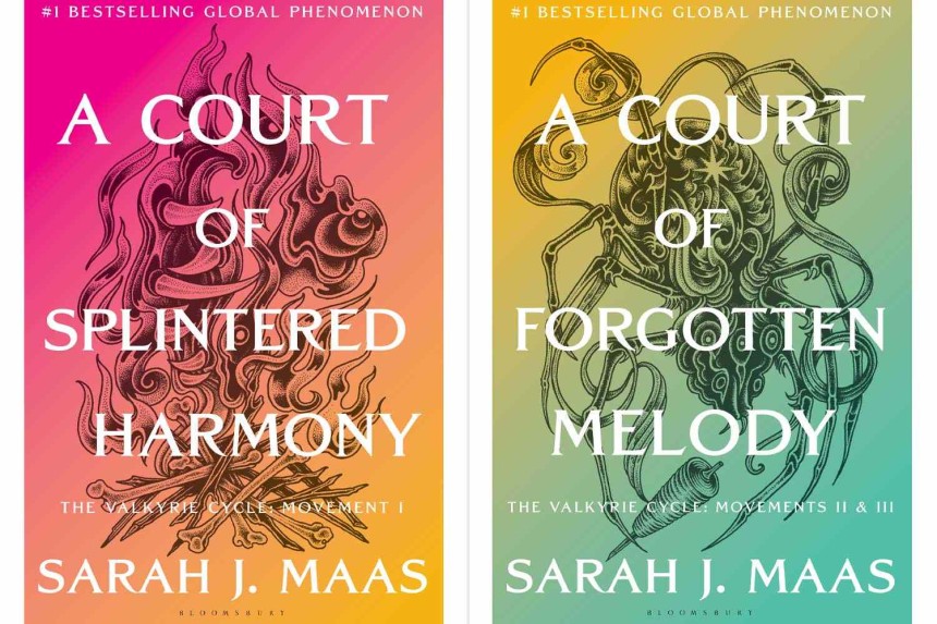
And judging by the reaction online, I am certainly not the only reader who looked at the newly revealed covers for A Court of Splintered Harmony and A Court of Forgotten Melody and felt a little… underwhelmed.
But here’s the problem with my disappointment:
I’ve already preordered them.
Of course I have.
Which made me wonder whether we’re actually having the wrong conversation about book covers.
Because the question isn’t really whether Sarah J. Maas’s new covers are beautiful. Beauty is subjective, and there are undoubtedly readers who love them.
The more interesting question is whether it even matters.
Sarah J. Maas Doesn’t Need a Pretty Cover to Sell You a Book
There was a time when a cover had a very specific job: convince someone browsing a bookstore to pick up a book they knew nothing about.
For most authors, it still does.
Sarah J. Maas is no longer most authors.
Bloomsbury describes her as a global publishing phenomenon, with more than 75 million books sold worldwide. Her A Court of Thorns and Roses series has become one of the defining series of the modern romantasy boom, and the newest books aren’t being introduced to an audience that needs to be convinced to enter Prythian.
We’re already there.
A Court of Splintered Harmony releases October 27, 2026, followed by A Court of Forgotten Melody on January 12, 2027, with Bloomsbury branding the two books as “The Valkyrie Cycle.”
And plenty of us had our wallets out long before we knew what either cover would look like.
I’m one of them.
So from a purely practical standpoint, what exactly does Sarah J. Maas’s cover need to accomplish?
Because apparently it didn’t need to convince me to buy the book.
But I Still Wanted More
That’s where things get complicated.
I can acknowledge that a cover doesn’t determine whether I’ll buy the next ACOTAR book while simultaneously admitting that I wanted something more beautiful.
And my bookshelf proves it.
My copies of both ACOTAR and Throne of Glass are hardcovers, but the versions displayed on my shelves don’t wear their original jackets.
My ACOTAR collection is wrapped in illustrated dust jackets from Bluelyboo, I even went as far as stenciling the edges myself.
While my Throne of Glass books wear artwork from Carrington Moore Studio.
I bought them because I wanted the outside of these books to feel like the worlds I loved on the inside.
And I’m hardly alone.
BookTok, Bookstagram and the larger online reading community have transformed bookshelves into something beyond storage. They’re décor. They’re collections. They’re a visual representation of the stories and worlds we love.
Readers buy sprayed edges, alternate covers, reversible dust jackets, foil embossing, illustrated endpapers and special editions of books they already own.
Sometimes several times.
We’ve essentially turned books into collectibles.
So maybe our expectations have changed along with the industry.
Somewhere Along the Way, “A Book” Became a Collectible
This is where I think some of the frustration surrounding major cover reveals comes from.
Readers aren’t necessarily comparing a new hardcover to the standard hardcovers sitting in Barnes & Noble ten years ago.
We’re comparing it to FairyLoot.
We’re comparing it to Illumicrate.
Exhibit A: My copy of the Fairyloot Edition of Immortals, by Sue Lynn Tan.
Exhibit B: My STUNNING Bridgerton Collection from Illumicrate.
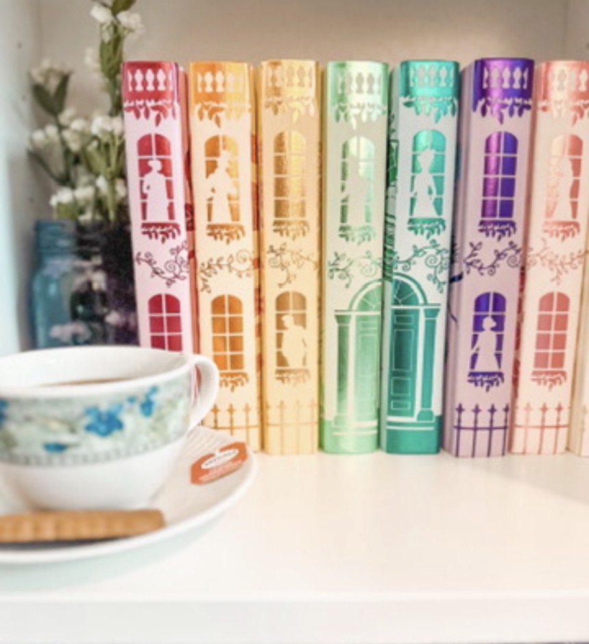
We’re comparing it to the breathtaking custom jackets created by independent artists, the intricately designed sprayed edges filling our social feeds and the special editions publishers themselves have taught us to anticipate.
We’ve been conditioned to see books as art objects.
And once you’ve seen what artists can do with a beloved fantasy world, it’s difficult not to imagine what could have been.
That’s especially true for a series as visually rich as ACOTAR.
Prythian has seven courts. The Night Court. The Dawn Court. The Day Court. The Spring Court. The Autumn Court. The Summer Court. The Winter Court.
There is certainly no shortage of imagery to pull from.
So when one of publishing’s biggest fantasy franchises receives a design that doesn’t feel particularly special to you, disappointment is understandable.
But disappointment and entitlement aren’t necessarily the same thing.
Does Sarah J. Maas Actually Owe Me a Beautiful Book?
No.
And I think that’s the part we sometimes forget.
Sarah J. Maas owes readers the book she and her publisher are selling us.
She doesn’t owe me a hardcover that perfectly coordinates with my living room.
She doesn’t owe me sprayed edges.
She doesn’t owe me foil.
And she definitely doesn’t owe me a cover designed around my personal interpretation of Prythian.
I’m allowed to dislike it.
I’m allowed to think an independent artist created something more beautiful.
I’m allowed to wish Bloomsbury had gone in a completely different direction.
But somewhere between “I wish this cover were prettier” and “fans deserved better,” there’s an important distinction.
Because what, exactly, did we purchase?
A story.
Everything else is packaging.
And Maybe That’s Why Independent Artists Matter So Much
Looking at my own bookshelf made me realize something else.
The fact that I prefer my custom dust jackets doesn’t necessarily mean the publisher failed.
It means an entire creative ecosystem has developed around the books we love.
Artists like Bluelyboo and Carrington Moore Studio can create something a mass-market publisher can’t possibly create for every individual reader: their version of the story.
And then I get to decide whether their interpretation looks like mine.
That’s actually pretty wonderful.
The official edition needs to be recognizable, marketable, producible on an enormous scale and appealing to millions of readers.
Fan artists and small businesses get to be specific.
Romantic.
Moody.
Elaborate.
Unapologetically designed for the person who wants their bookshelf to look like an entrance to Prythian.
Maybe those two things don’t have to compete.
But Publishers Aren’t Completely Off the Hook Either
There is another side to this.
If publishers want readers to treat books as collectible objects, they can’t be surprised when readers judge them as collectible objects.
You can’t market deluxe editions, redesign entire series, release exclusive retailer editions and encourage readers to purchase multiple copies of the same story—and then pretend aesthetics don’t matter.
They clearly do.
Publishers know they do.
The modern special-edition market exists because readers have demonstrated again and again that they’ll pay for beautiful books.
So while I don’t think an author owes us a gorgeous cover, I do think publishers should understand that design has become part of the purchasing experience, particularly in fantasy and romantasy.
We’ve been taught to care about the package.
Of course we’re going to have opinions when we don’t like it.
And Then There’s Me, Clicking “Preorder”
Which brings me back to my original problem.
I don’t particularly like the new covers.
I wanted something moodier. More fantastical. Something that made me stare at the artwork looking for tiny clues about the story.
And yet…
Preordered.
Because after all the discourse about colors, typography, artwork and whether these covers sufficiently represent ACOTAR, Bloomsbury already had the one thing that matters most:
I want to know what happens next.
That’s the luxury of reaching Sarah J. Maas’s level of success.
The cover no longer has to introduce the story.
The story sells.
Not the cover.
And maybe that’s the ultimate sign that an author has made it.
Maybe the Problem Isn’t the Covers
Maybe our bookshelves have simply changed.
We’ve gone from buying books to collecting editions. We’ve watched independent artists turn dust jackets into works of art. We’ve built rainbow shelves, sprayed-edge shelves and entire rooms dedicated to fictional worlds.
Naturally, our standards followed.
So no, I don’t think Sarah J. Maas owes me a beautiful book cover.
I don’t even think she owes me one I like.
But I’m also going to keep celebrating—and buying from—the artists who look at the same stories I love and somehow create the version I wish existed on my shelf.
And when A Court of Splintered Harmony arrives at my door?
I’ll probably tear into the box, stare at the cover for approximately five seconds, open the book and immediately forget what I was complaining about.
At least until someone releases a gorgeous custom dust jacket for it.